Trends in Interior Design: Shift from Cool Grays to Warmer Hues
As 2027 approaches, interior designers are predicting a shift away from cool grays and towards warmer, more inviting colors.
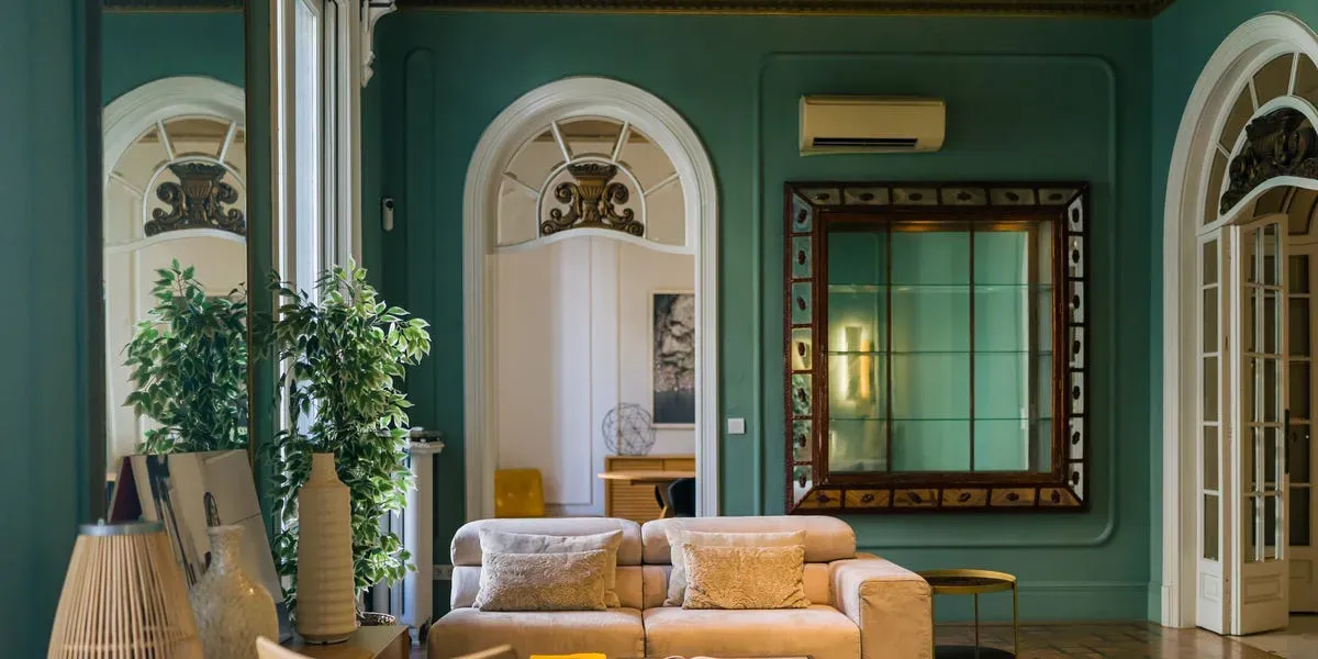
As 2027 approaches, interior designers are beginning to share their predictions for the year's hottest trends and fading favorites.
Paint colors are always a topic of interest, and designers are now weighing in on which hues will soon be out of style. While it's natural to wonder what new colors will dominate, it's also intriguing to consider what's starting to fall out of favor.
Interior designer Melissa Couture believes that the shift away from certain paint colors isn't about abandoning color altogether, but rather about how it's being used. According to her, highly saturated shades are losing ground to softer, muddier versions with warmer undertones, a trend reflected in her predictions for 2027.
Cool grays are slowly losing their appeal as a dominant paint color trend. The shift towards warmer hues is evident in the predictions made by several designers for 2027. According to Jeremy Harnish, founder of JH Wall Paints, the last decade's emphasis on cool gray-based neutrals is giving way to a more inviting and warm aesthetic.
Designers are increasingly favoring warmer undertones over the cold, gray tones that have been popular in recent years. Emily Hodge notes that incorporating cool grays into a space can limit the palette to cool tones, creating an uninviting atmosphere. In contrast, embracing warmer gray tones can create a more welcoming and dynamic environment.
As design trends evolve, pastels are also falling out of favor, making way for rich jewel tones. Lauren Robbins, founder of Lauren Robbins Interiors, believes that soft pastels should be replaced with deeper, more vibrant colors in 2027.
Designers are looking beyond soft pastels for 2027's color trends, opting instead for richer hues that add depth and drama to spaces. Rich emerald greens, sapphire blues, deep burgundies, and amethyst purples are among the top picks.
While black may be out as a dominant accent color, it can still be used in moderation, such as on handrails or front doors. Designer Andrea Sinkin suggests turning to burgundy as an alternative, citing its rich texture and warmth that lingers in a space.
Facts based on reporting originally published by Good Housekeeping.
You may republish this story, in full or in part, if you credit News Central Site and link to it (licence CC BY 4.0). Photos are not included.